The maker of magic · Interactive, XR and TouchDesigner · 2026
My Brand Identity
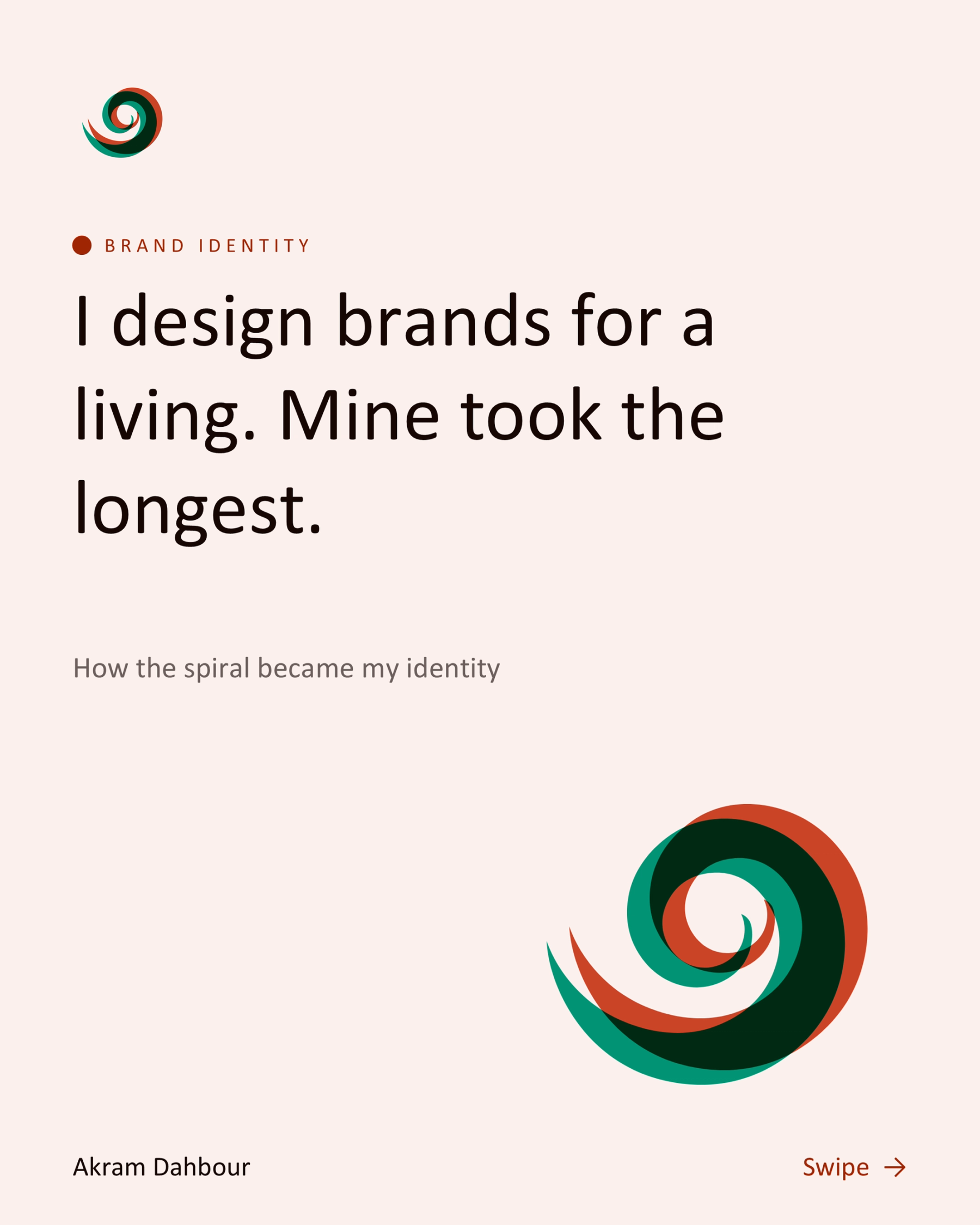
How the golden spiral became my identity: the thread, the maths behind the colours, and the misregistration signature.
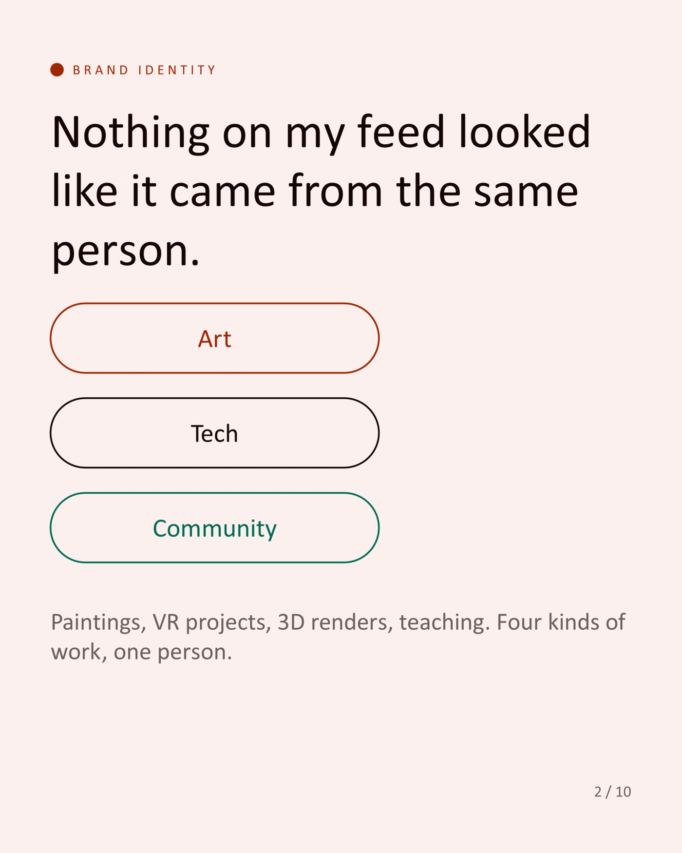
Nothing on my feed looked like it came from the same person.
Art, tech, community. Paintings, VR projects, 3D renders, teaching. Four kinds of work, one person.
The thread: finding the second meaning inside the ordinary.
That is what I do in a painting, in code and in a brand. I needed a mark that said it.
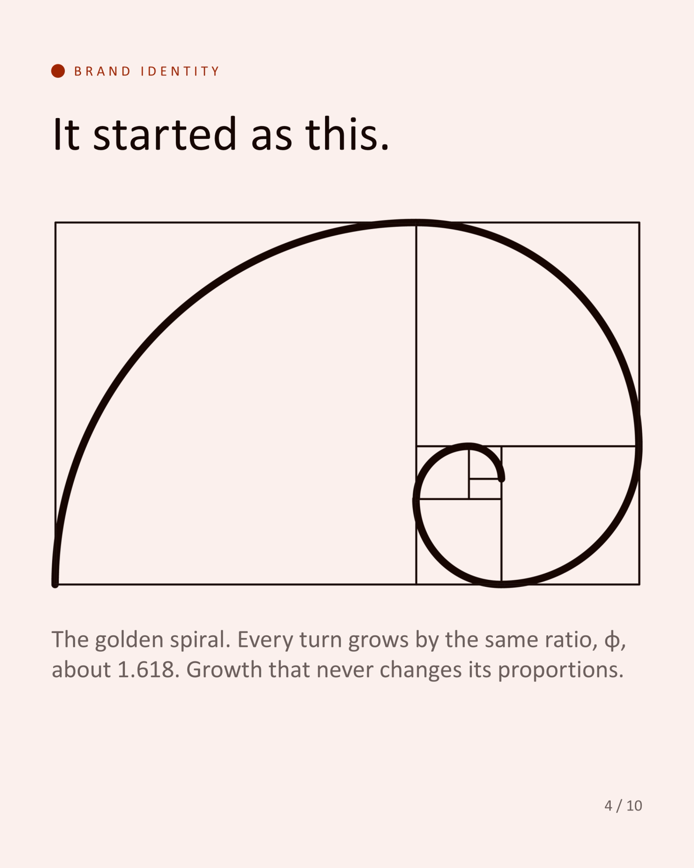
It started as this.
The golden spiral. Every turn grows by the same ratio, φ, about 1.618. Growth that never changes its proportions.
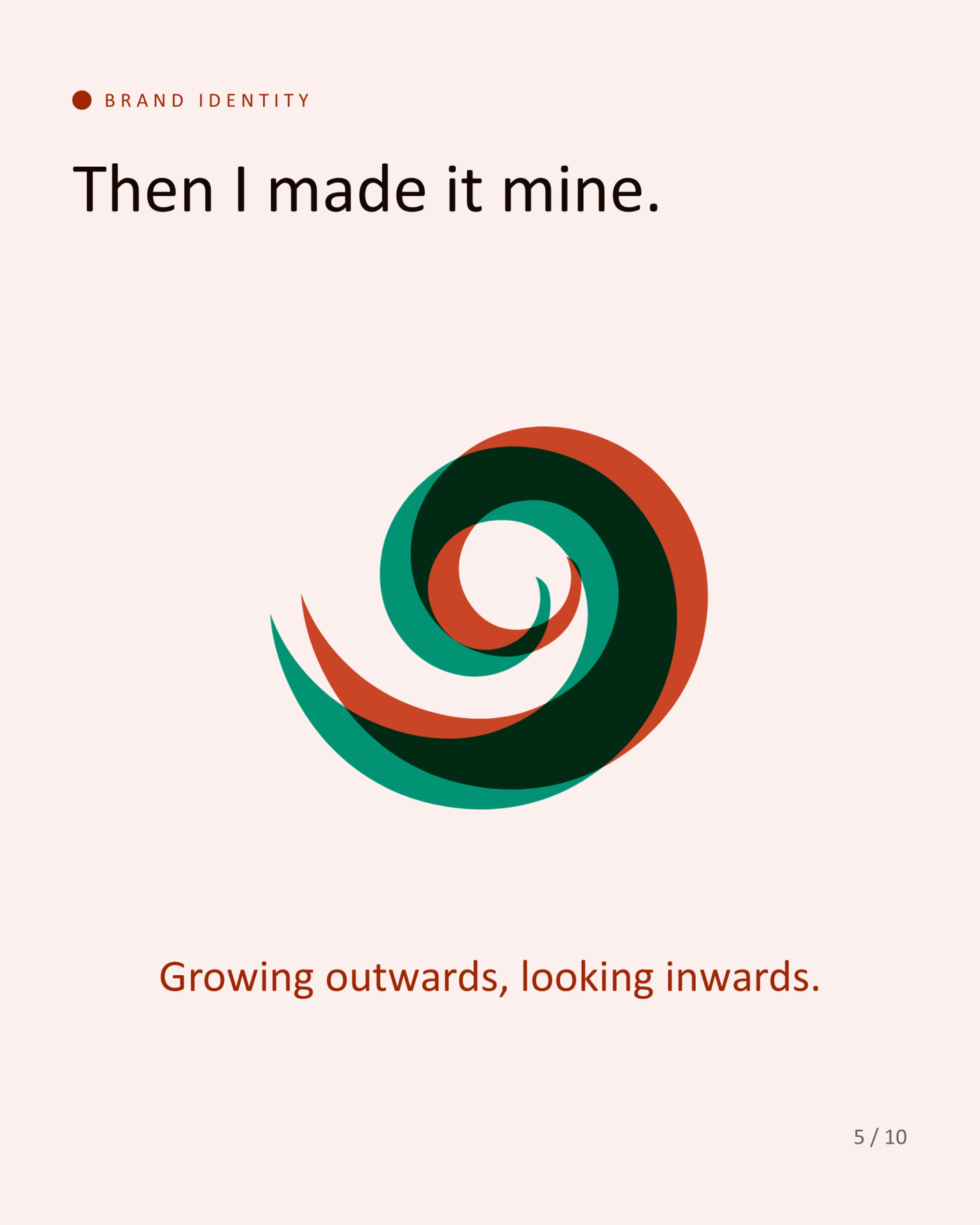
Then I made it mine.
Growing outwards, looking inwards.
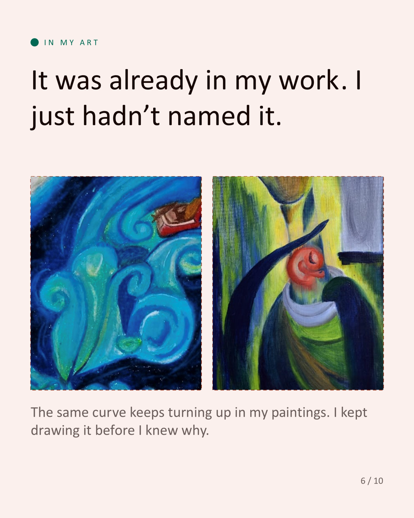
It was already in my work. I just hadn't named it.
The same curve keeps turning up in my paintings. I kept drawing it before I knew why.
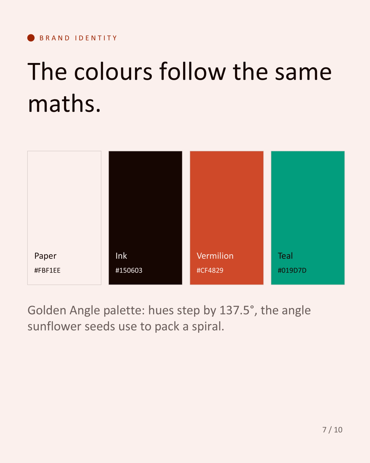
The colours follow the same maths.
Paper #FBF1EE, Ink #150603, Vermilion #CF4829, Teal #019D7D. Golden Angle palette: hues step by 137.5°, the angle sunflower seeds use to pack a spiral.
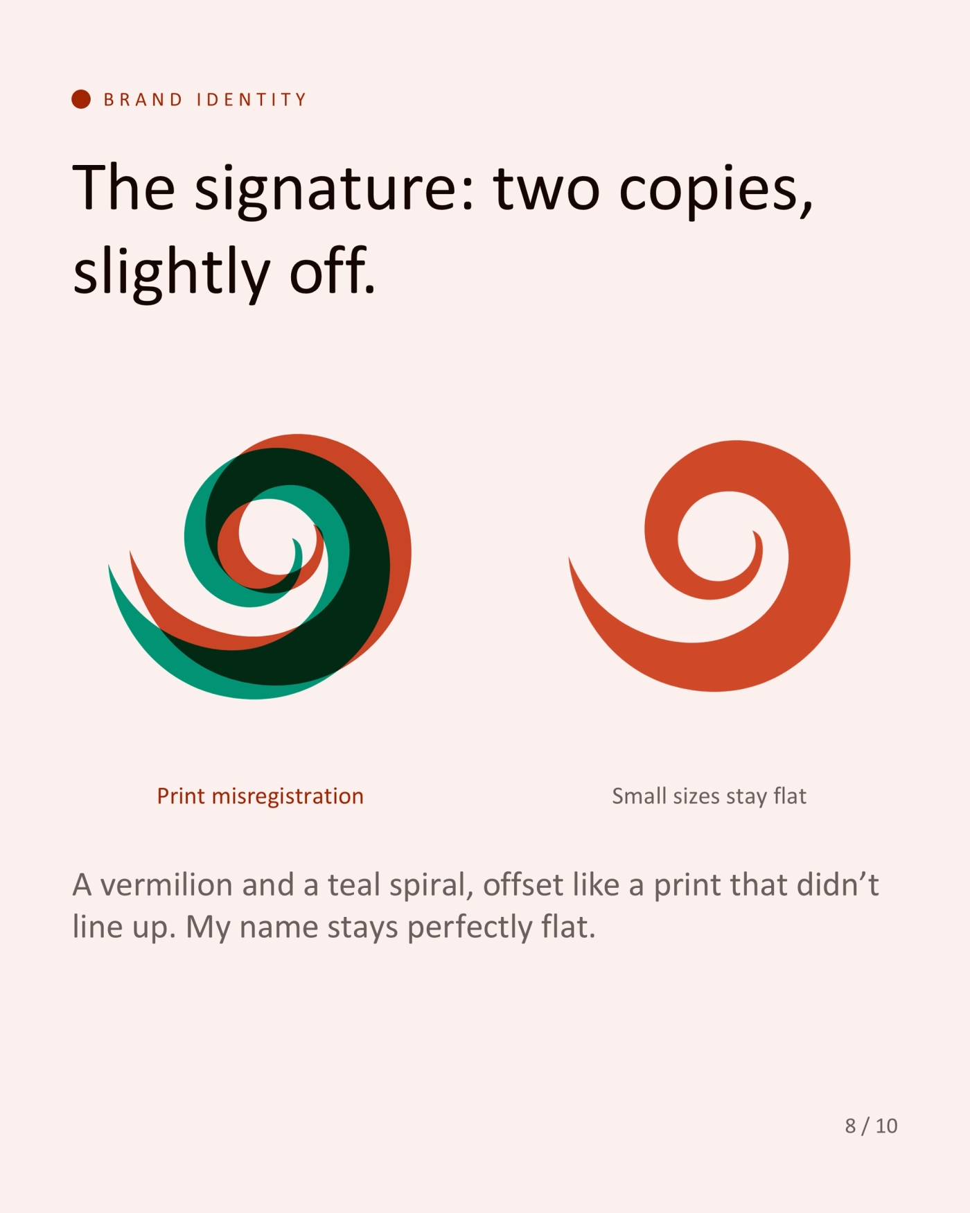
The signature: two copies, slightly off.
A vermilion and a teal spiral, offset like a print that didn't line up. Small sizes stay flat. My name stays perfectly flat.
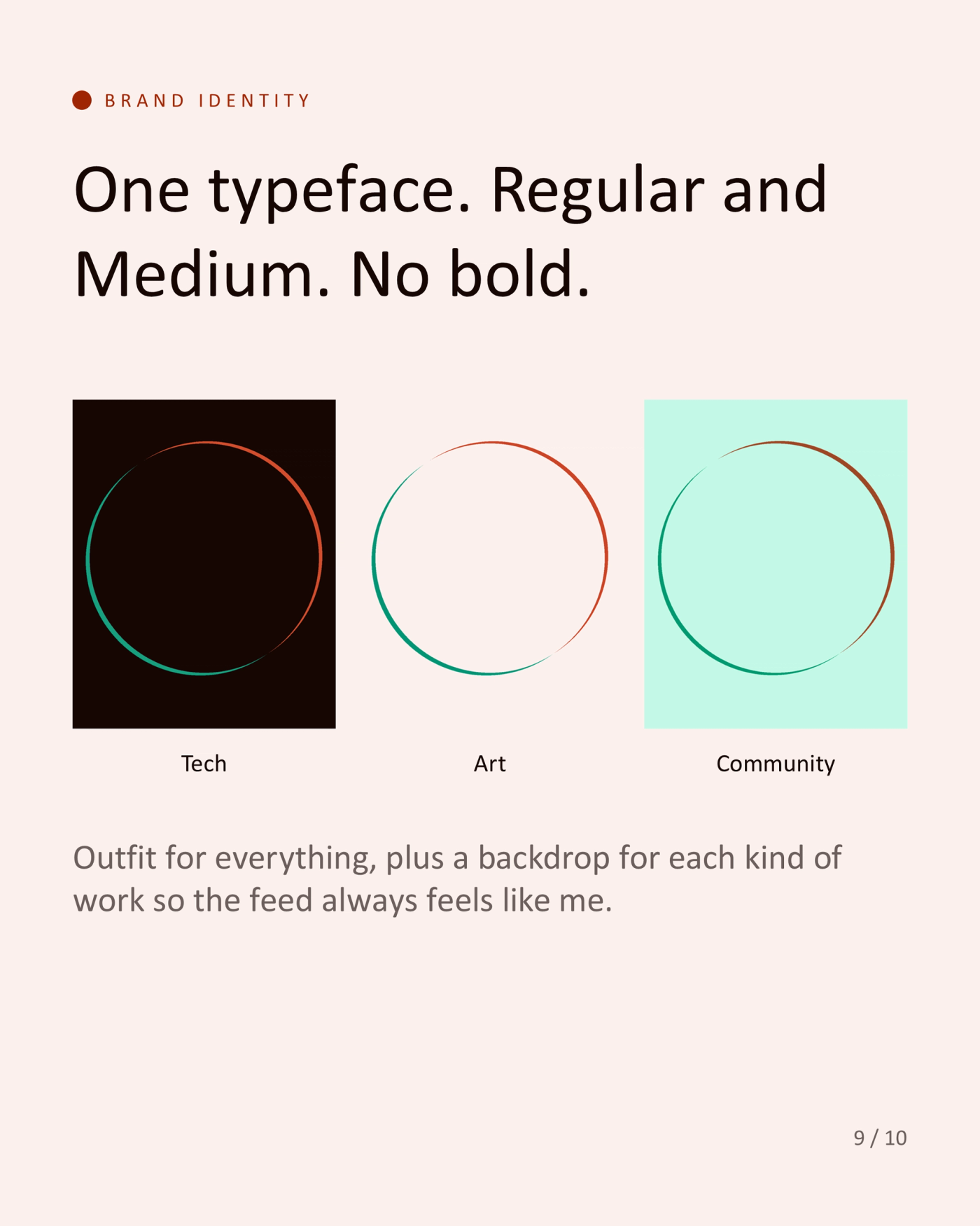
One typeface. Regular and Medium. No bold.
Outfit for everything, plus a backdrop for each kind of work (tech, art, community) so the feed always feels like me.
A brand isn't a logo. It's a decision you make once.
What would you never put on your own brand?
Tools used
- Branding
- Identity system