How I did it · 15 November 2026
I built the brand for a studio that makes spaces feel alive.
MAHO, Magically Interactive: the visual identity for a Riyadh studio building real-time interactive experiences.
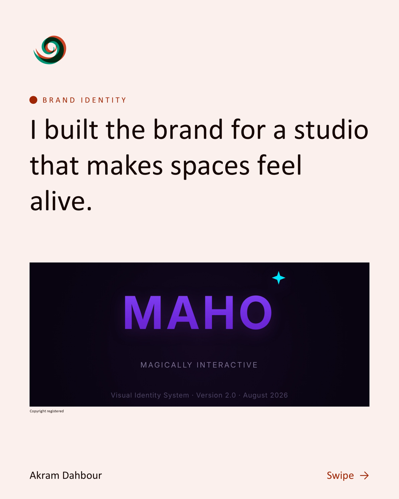
MAHO, Magically Interactive. Visual Identity System, Version 2.0, August 2026.
MAHO: Magically Interactive.
Four founders, one studio in Riyadh: Mahmoud, Akram, Hammam, Osama. Real-time, interactive experiences built with Unity, TouchDesigner and Python. The brief to myself: make the identity feel like stepping into one of our installations.
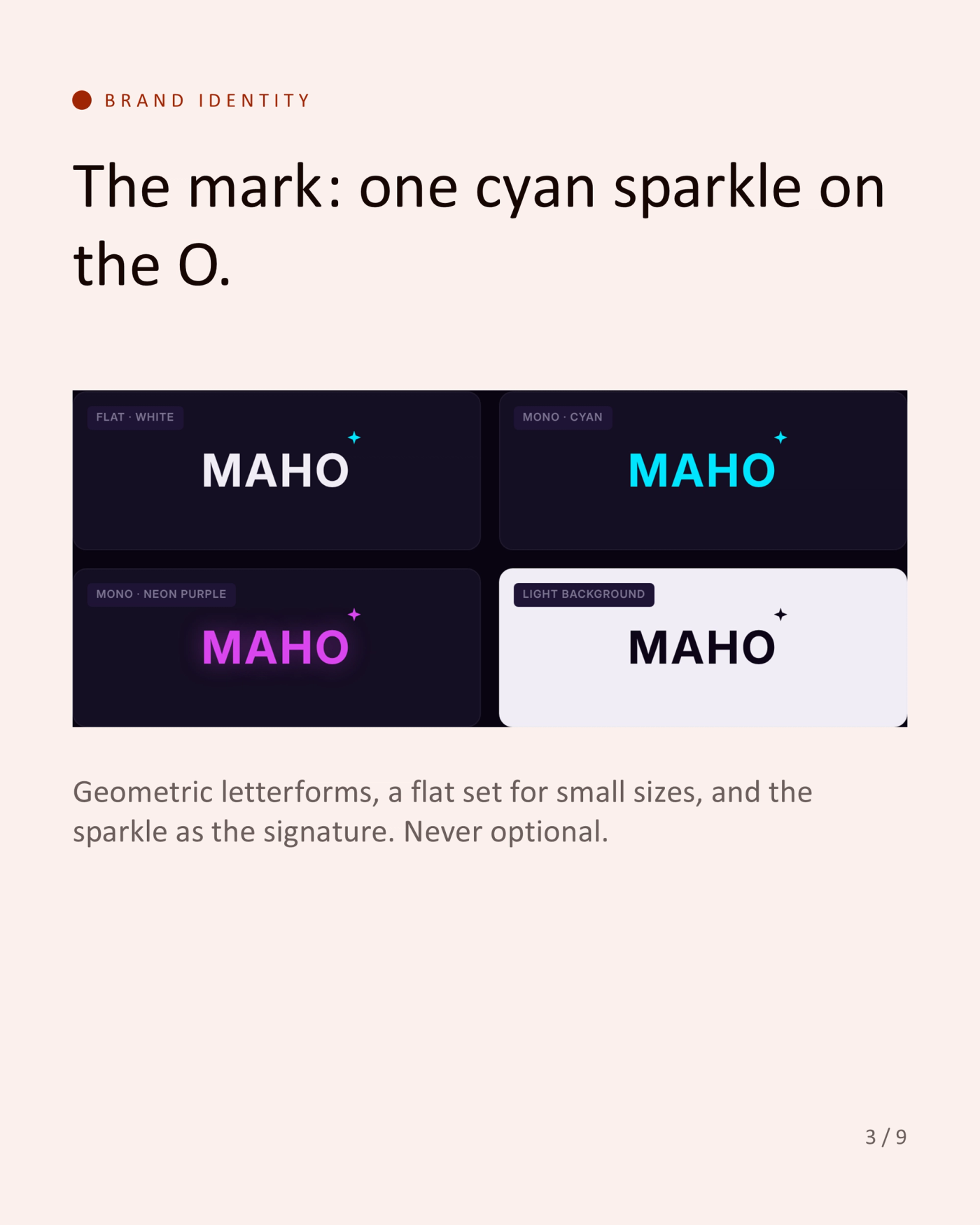
The mark: one cyan sparkle on the O.
Geometric letterforms, a flat set for small sizes, and the sparkle as the signature. Never optional.
Colour: the dark void, lit by neon.
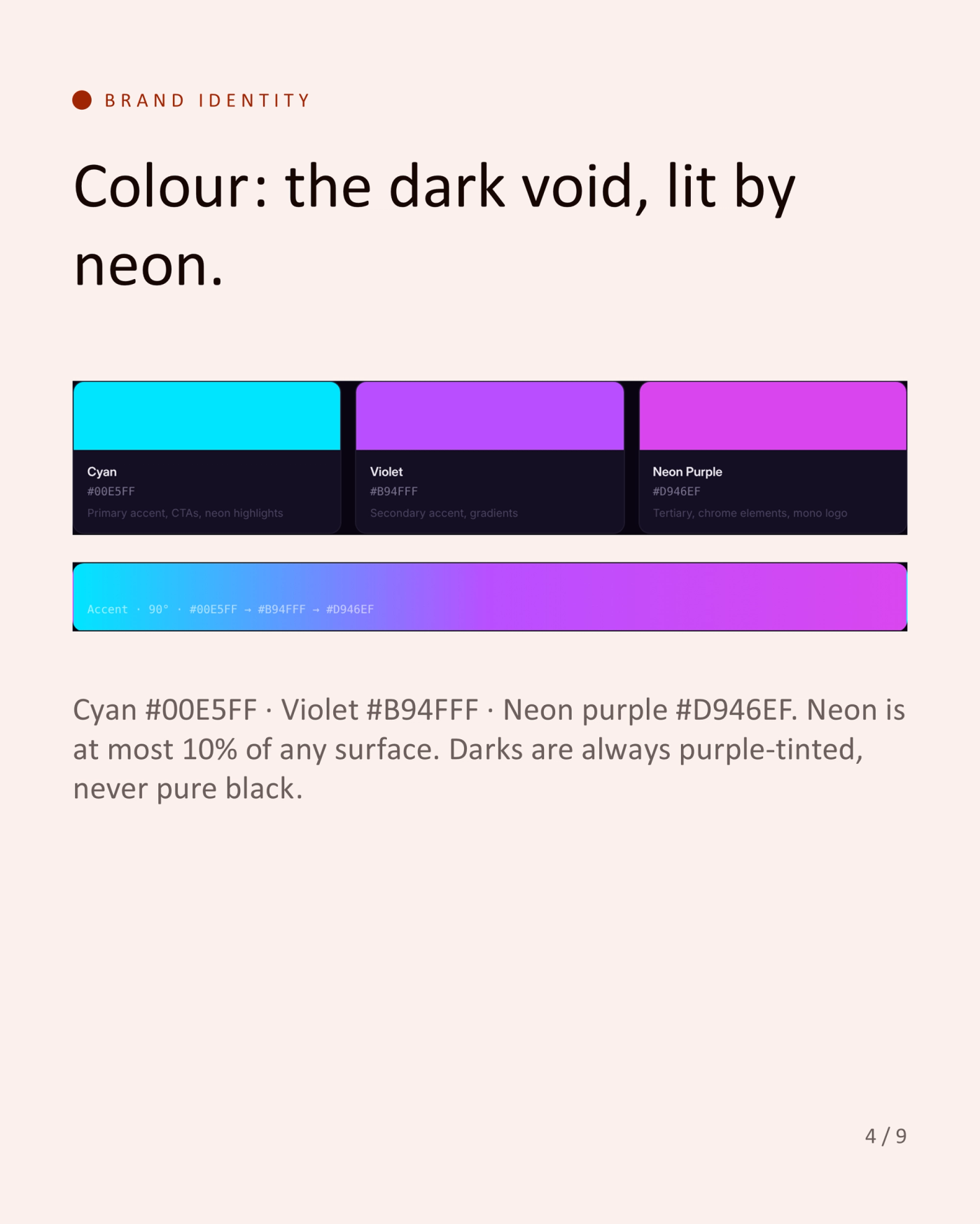
Cyan #00E5FF, Violet #B94FFF, Neon purple #D946EF. Neon is at most 10% of any surface. Darks are always purple-tinted, never pure black.
Type: angular and technical.
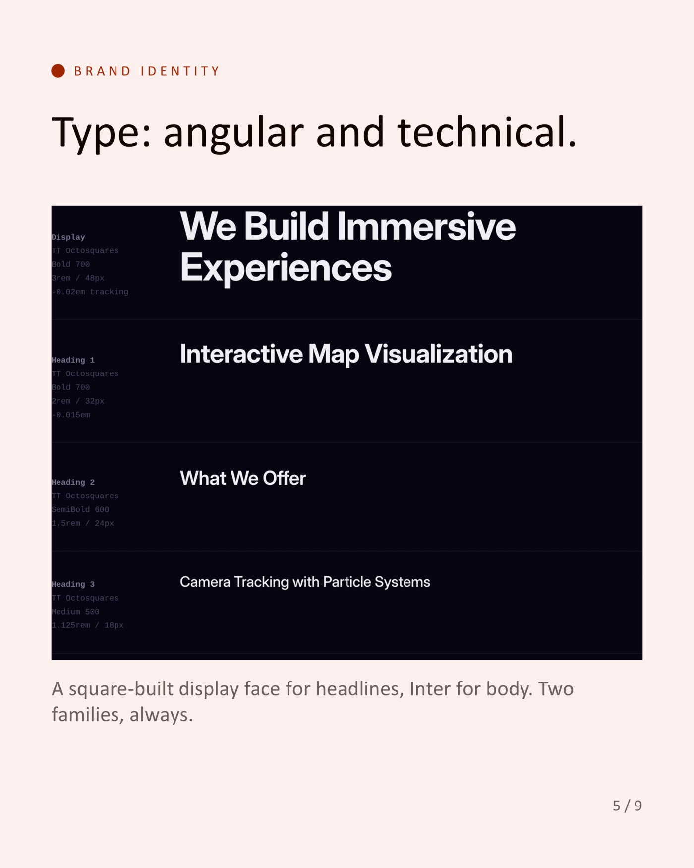
A square-built display face for headlines, Inter for body. Two families, always.
Three chrome objects, used sparingly.
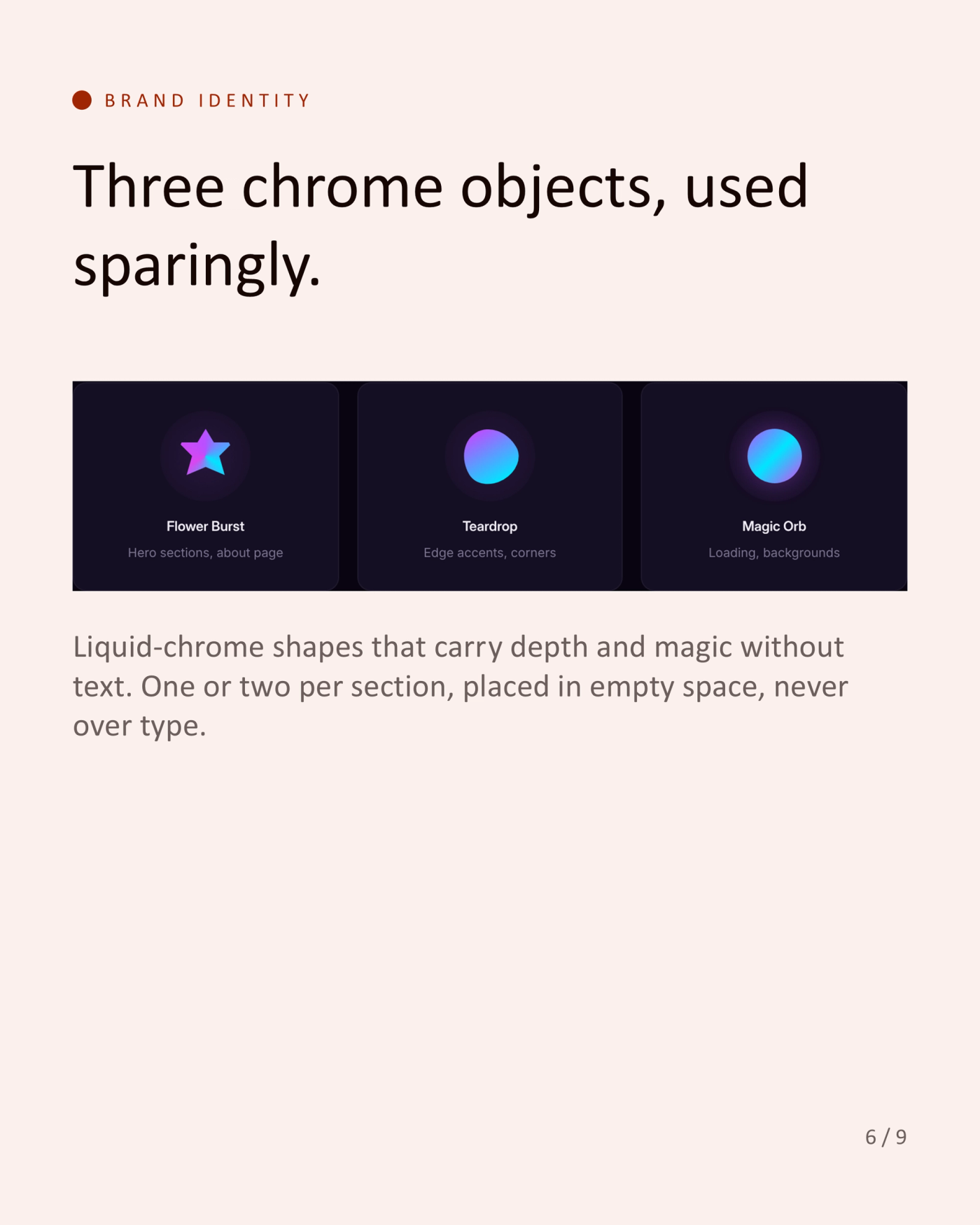
Flower Burst, Teardrop and Magic Orb: liquid-chrome shapes that carry depth and magic without text. One or two per section, placed in empty space, never over type.
Rules that keep it magical.
Never a hard glow above 30% opacity: subtle is magical, strong is cheap. Never warm colours, rainbow gradients or untinted greys. Always slow, elegant motion: sparkle pulses and gentle floats, no bounce. Always generous negative space: the void between elements is the design.
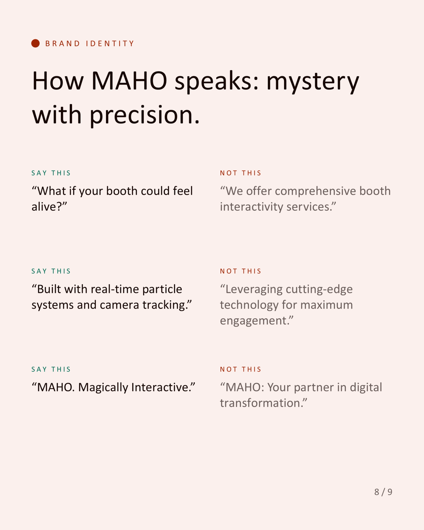
How MAHO speaks: mystery with precision.
Say "What if your booth could feel alive?", not "We offer comprehensive booth interactivity services." Say "Built with real-time particle systems and camera tracking.", not "Leveraging cutting-edge technology for maximum engagement." Say "MAHO. Magically Interactive.", not "MAHO: Your partner in digital transformation."
A brand should feel like the thing it sells.
What if your booth could feel alive?
Tags
- Brand identity